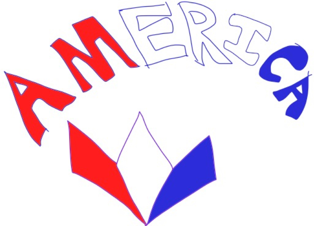
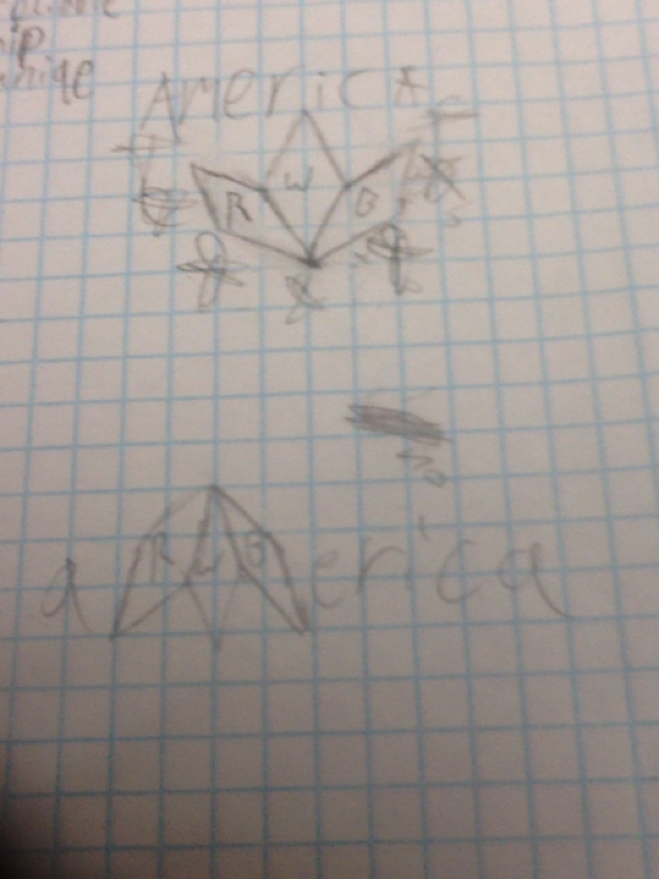
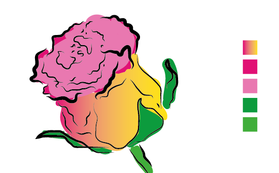
This post is about tweaking the design of my logo. When I decided to show off my logo at first I thought it was extremely sound, but it was missing something to make it pop and people agreed with me. So I changed the thickness of the borders and it improved it a lot. I asked around and people thought so too. So I'll keep it like that as my final version
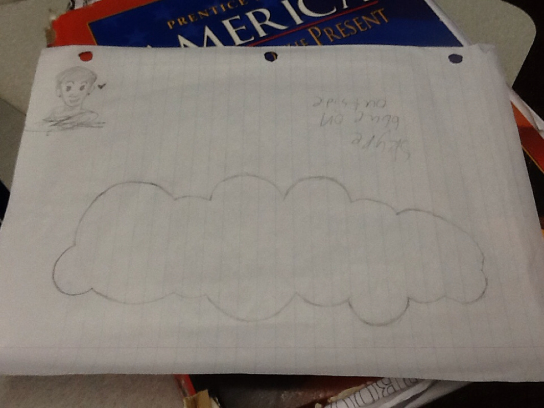
This blog post is about me starting to make my infograpic. I think currently it's going fine, but I feel like the bumps should be a bit rounder but I'll fix that later. The tracing looks on point but currently it's upside down I can also fix that if I think it's needed or looks better upside up than down. I ran into a problem when trying to download the exact Skype logo font as I order to install it I needed the administrator password so I decided to use a font that in illustrator that is similar but not exactly the same. Other than what was described its going great. This post is organizing my thoughts on the project. When I was tracing the cloud design on paper I needed to have the rule of thirds in it so I made each of the bumps on the outside of the cloud full circles and parted up the clouds into sections. I don't think I have very much design that would be mine but I am going to make people think of Skype not by keeping the colors, putting it in the cloud, and using the logos font. I didn't take any risk if copyright infringement doesn't count and I'm pretty sure it won't but it is practically the same thing as the actual Skype logo although I don't think I would be infringing on anything as I am not gaining profit from this. Other than that I am keeping this pretty safe and not really reaching new grounds. This is my blog post about what went through my mind while making my infograpic. I decided to use Skype as my topic when I was on Google and couldn't think and accidentally pressed the s key on the keyboard and Skype was the first option. I realized that Skype would be perfect because it has a lot of readily available information on the Internet and something easily recognizable by people. When I was looking through infograpics of others I noticed that most of them had the iconic blue from the Skype logo so I thought, "why not make it inside the cloud of the Skype logo?" So I studied the logo for a bit and started tracing the cloud on paper to put into Adobe illustrator later. I then started to look up facts I can use for the infograpic. While searching I thought about comparing things like time to the lifespan of a human living in the United States. Using things like those stick people you see on bathroom signs to count how many lives and such. As well as trying to find real life things to compare money to. My goal for this peice is just to make something informative and easy to understand for people who may not know this information. This post is about me brainstorming about my logo design. For this project we are making logos for a marketing class in my school. Everyone in the class got their own client from the other class to do a logo for their made up company. I'm making the new logo for the soccer team that will represent america in world events. The manger wanted the logo to be a european shield that was black and blue. I didn't believe it was a good design so I changed it. I didn't make it the way the client wanted it, but I believe it was for the better. I think it'll stand out more because every soccer team logo has that shield design and a soccer ball. This logo has none of those so people will remember it better, because it is different form the rest. Making a logo isn't very difficult. It is, however, not very detailed art. I had to stop myself from thinking the way I usually do when it came to making art. I did need to research and see other companies logos to make mine. While gathering I realized that about every logo looked the same. My client wanted me to make one similar, but I decided to instead make something different. I made this decision to try to separate us from the rest. I also decided that having the American colors would be beneficial so even without the word America on top people can tell who we are and where we are from. I believe the dimonds aren't the exact same widthand it feels awkward when working with it and I tried to fix it but it ended up being a bust as no matter what I did I couldn't seem to fix it but it isn't really noticeable just looking at it. I didn't really change anything from the previous design, but I didn't add stars to it because I didn't think it would work so I kept it out. Beginning to create my logo I decided to make a rough sketch in Adobe ideas. With my plan of action figured out I then got on Adobe illustrator and started to make it. I actually ran into a problem really quickly as I needed to think if I wanted the colors to be in rgb. I decided go rgb because it would be easier for my color scheme. After I did this I realized that the shape tool can't make dimonds. So I had to do it by hand. This post, as obviously stated in my title, is for my typography project where I have to make a poster centered around a typeface and make it have a meaning. For this project i will use "Tenny mucho mucho deniro in su trucky-trailer" for the word in the poster. I will also use an elegant cursive font that is sarcastic as well to show that civil forfeiture is really stupid and that the police who do that are also stupid. Civil forfeiture is when the police have reason to suspect that something you have could be used for criminal purposes then they are able to take it. The thing is you aren't on trial your stuff is and your stuff has way less rights than you do. Things such as your stuff is guilty until proven innocent. I want to show it in a negative light and make more people aware that this is a thing. The fonts I am thinking of using are Giddyup Std and/or Little Days.
This is brain storming for our first project. What I had in mind was this type of door way thing that would look like its going into itself until it reaches a sunny outside place with grass and a cloud maybe. I am planning on making the surrounding doors different shades of blue getting a bit lighter as it goes in. in the inside of the doors I want some type of field. I got this idea from this weird dream I had. I saw the door on the floor of the library and it looked like how I described it. I was in the shower when I remembered about the dream and thought, "why not?" My goals for this project it to make it in on time, unlike my other assignments last year, and to make this look as close to what I saw in my dream as I can. For the effect of the outside I was thinking of drawing it in illustrator or photoshopping it in.
This is about me learning to use Adobe Illustrator CC5 by watching 12 youtube tutorials. It was pretty easy, but the hardest part was the pen tool lesson because of the large learning curve as the pen tool needed the most precision. I feel a lot more confident in my ability to make art in Adobe Illustrator because of these tutorials and I cannot wait to make my own original art. there wasn't much creativity in this assignment as all I was doing was copying what I saw on screen, but by doing so I was able to understand the tools better. I did run into some problems while working because in the tutorial the person used a different version of Adobe Illustrator and had different tools than what i had available and so I either had to use workarounds or just ignore what he was teaching. Although he had all the tools we had and only two or three were different.
|
AuthorErik Camacho Archives
December 2014
Categories
All
|