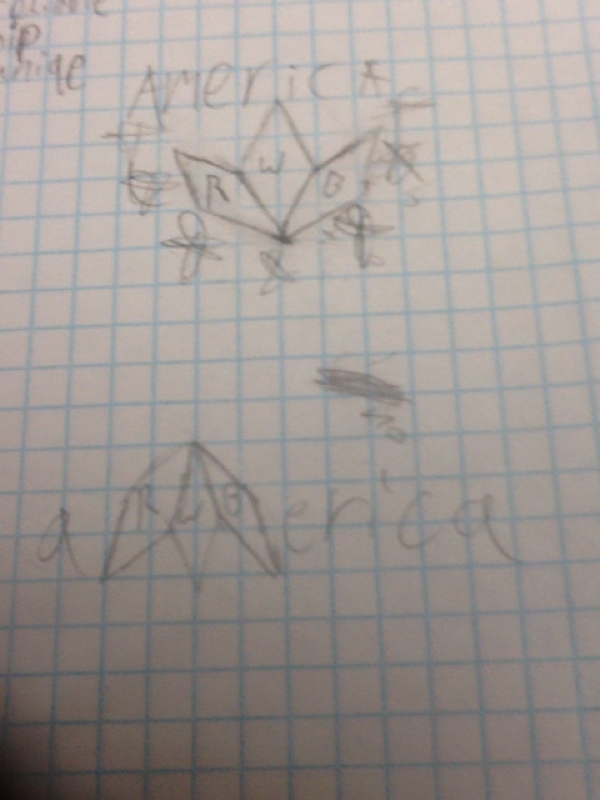
This post is about me brainstorming about my logo design. For this project we are making logos for a marketing class in my school. Everyone in the class got their own client from the other class to do a logo for their made up company. I'm making the new logo for the soccer team that will represent america in world events. The manger wanted the logo to be a european shield that was black and blue. I didn't believe it was a good design so I changed it. I didn't make it the way the client wanted it, but I believe it was for the better. I think it'll stand out more because every soccer team logo has that shield design and a soccer ball. This logo has none of those so people will remember it better, because it is different form the rest.
This is about me learning to use Adobe Illustrator CC5 by watching 12 youtube tutorials. It was pretty easy, but the hardest part was the pen tool lesson because of the large learning curve as the pen tool needed the most precision. I feel a lot more confident in my ability to make art in Adobe Illustrator because of these tutorials and I cannot wait to make my own original art. there wasn't much creativity in this assignment as all I was doing was copying what I saw on screen, but by doing so I was able to understand the tools better. I did run into some problems while working because in the tutorial the person used a different version of Adobe Illustrator and had different tools than what i had available and so I either had to use workarounds or just ignore what he was teaching. Although he had all the tools we had and only two or three were different.
|
AuthorErik Camacho Archives
December 2014
Categories
All
|