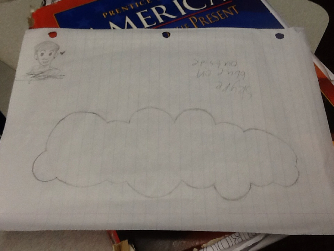
This is my blog post about what went through my mind while making my infograpic. I decided to use Skype as my topic when I was on Google and couldn't think and accidentally pressed the s key on the keyboard and Skype was the first option. I realized that Skype would be perfect because it has a lot of readily available information on the Internet and something easily recognizable by people. When I was looking through infograpics of others I noticed that most of them had the iconic blue from the Skype logo so I thought, "why not make it inside the cloud of the Skype logo?" So I studied the logo for a bit and started tracing the cloud on paper to put into Adobe illustrator later. I then started to look up facts I can use for the infograpic. While searching I thought about comparing things like time to the lifespan of a human living in the United States. Using things like those stick people you see on bathroom signs to count how many lives and such. As well as trying to find real life things to compare money to. My goal for this peice is just to make something informative and easy to understand for people who may not know this information.
 RSS Feed
